
How to customize the default Substack subscribe form
September 2, 2026 · 11 min read
The subscribe form Substack gives you is fine until you put it on your own site. Then it stops looking like your site. The fonts are not yours, the button colour is not yours, and there is no room for the one sentence that actually convinces someone to sign up.
This walkthrough shows how to build a subscribe form in Quillo that matches your brand, where the signup still lands in your Substack list, and what you get on top: stored entries with delivery status, CSV export, and per form view and submission counts.
Why customize the default Substack form at all
A signup form is a small piece of a page doing a large piece of work. When it looks borrowed, readers hesitate. When it matches the page around it, they treat it as part of the site they already decided to trust.
There are three practical reasons writers move off the default embed:
- Brand fit. Your own typeface, colours, corner radius, borders and spacing instead of a fixed grey box.
- Copy control. A heading and a subheading you can write and rewrite, so the promise is clear before the email field.
- Visibility into signups. The default embed gives you a subscriber count later. A stored entry tells you what happened at the moment someone typed their email.
Quillo does not replace Substack. Your list, your posts and your billing stay on Substack. Quillo is the front end and the record keeping around the signup.
Create your first form in about two minutes
- Open Embeds in the Quillo studio and choose New subscribe form.
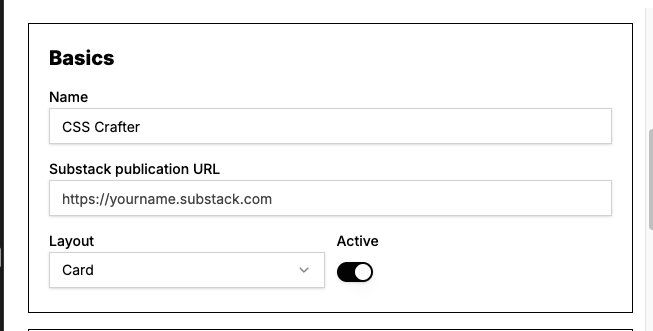
- Paste your publication URL, for example yourname.substack.com. This is the destination every signup is sent to.
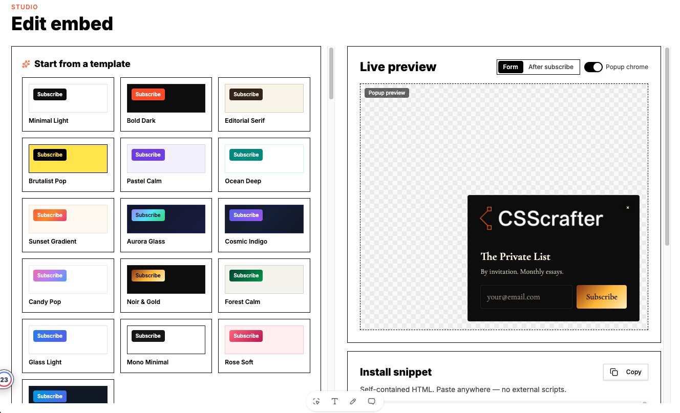
- Pick a starting template, then edit anything you want.
- Copy the snippet and paste it into your site where the form should appear.
You can create as many forms as you like. Most writers end up with a few: one wide form for the homepage, a compact one for the sidebar or footer, and a popup for long articles.
Start from a template, then make it yours
Templates exist so you do not start from an empty style sheet. Each one sets colours, fonts, radius and spacing in a way that already looks finished. Minimal Light is quiet and works on almost any site. Bold Dark suits dark sites. Editorial Serif reads like a magazine. Brutalist Pop is loud on purpose. Aurora Glass and Noir and Gold sit at the softer and the more premium ends.
Applying a template only fills in values. Nothing is locked afterwards, so you can take Editorial Serif and swap the accent colour to your brand orange without losing the rest.
The style controls, one by one
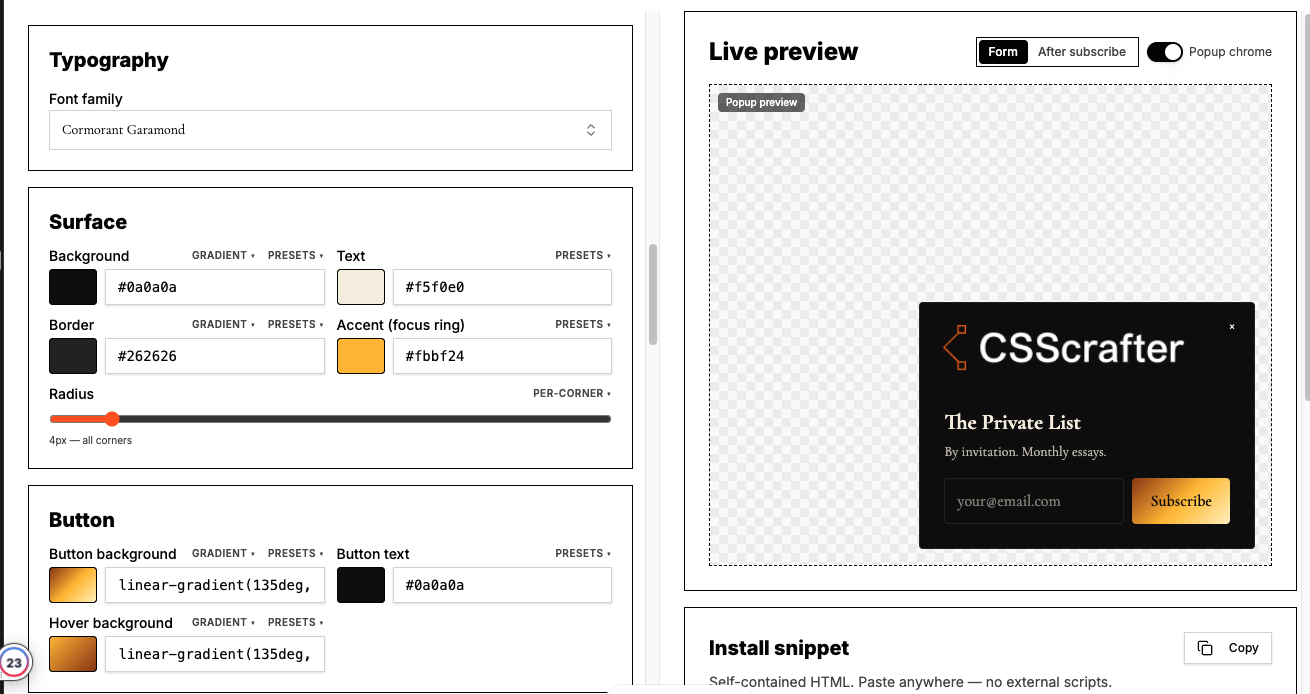
This is where most of the work happens, and it is all live. The preview beside the panel is the same renderer that runs on your site, so what you see is what visitors get.
Colours and typography
- Background, text, accent and button colours, each set independently.
- Font family for the form, plus separate size and weight for the heading and the subheading.
- Text alignment for the card, so a centred hero form and a left aligned footer form can share one design language.
Borders, radius, padding and gaps
- Card border colour and width, or no border at all when the form sits inside an existing box.
- A separate border for the email input, which matters on dark backgrounds where a borderless field disappears.
- Corner radius from square to fully rounded.
- Card padding, and the gap between the heading, the subheading and the form row.
Layout is a separate choice from styling. Inline puts the field and the button on one row, which is right for wide areas. Card stacks them inside a bordered box. Minimal strips the chrome down to a field and a button for tight spaces like a footer.
Inline, popup and overlay display modes
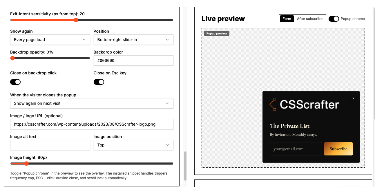
The same form can appear in different ways. Inline sits in the flow of the page. Popup and overlay modes wait for a trigger and then show the form above the page.
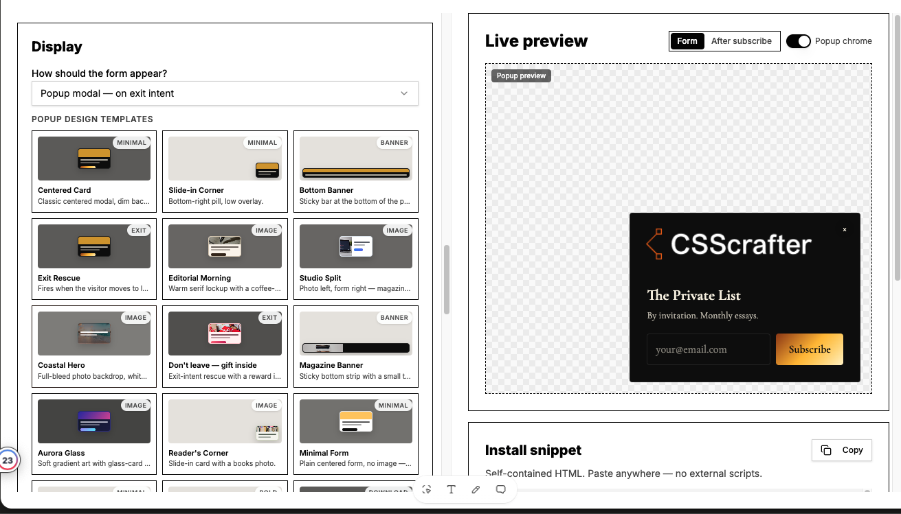
Popups have their own settings so they do not become annoying: a delay before showing, a scroll depth trigger, exit intent, and how long to stay quiet after someone dismisses it. Pick one trigger and one frequency rule and leave it there. Two triggers on one page is how you lose the reader you were trying to convert.
Offer a reward after signup
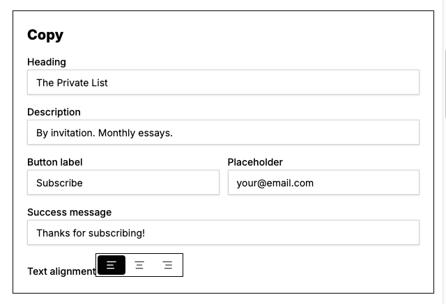
A lead magnet works better when the reader gets it immediately. In the reward panel you can set a success message and a link that appears the moment the signup goes through, so the promised guide, template or resource is one click away instead of waiting on an email.
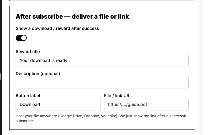
Keep the promise specific. A message that says here is the checklist you asked for, with a working link, does more for trust than a generic thanks for subscribing.
Spam controls that do not punish real readers
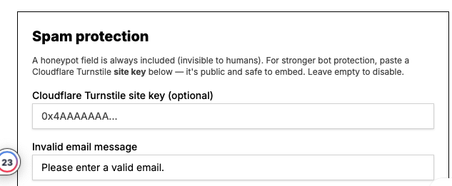
Any public form collects junk eventually. Quillo filters the obvious cases without adding a puzzle for humans to solve:
- A hidden honeypot field that only automated scripts fill in.
- A minimum time on the form, so submissions that arrive instantly are treated as automated.
- Filtering of throwaway inbox domains.
- A per visitor hourly limit, so one source cannot flood a single form.
Entries, delivery status, retry and CSV export
This is the part the default embed cannot do. Every signup on a Quillo form can be stored as an entry that only you can read, with the email, the time, the form it came from, and its delivery status.
- Delivered means Substack accepted the signup.
- Pending means the signup is stored and waiting on a retry, which happens automatically with a backoff between attempts.
- Failed means the attempts were used up. You can retry it yourself from the entries list.
Export the list as CSV whenever you want a copy, for a backup or to move it into another tool. If you would rather not store anything, the storage switch on each form turns entries off and the form runs in delivery only mode.
Stored entries are kept for 12 months and then removed automatically. There is also an account ceiling of 50,000 stored entries. Neither of those affects delivery to Substack.
Views, submissions and conversion rate
Each form reports how many times it was seen, how many people submitted, and the conversion rate between the two. Views are counted once per reader per day, so a reader who reloads a page five times does not inflate the number. Bot submissions, instant submissions and throwaway inbox addresses are excluded from the counts.
Analytics have fair use ceilings of 50,000 views and 5,000 submissions per month. When a ceiling is reached, counting pauses for the rest of the month. Signups keep being delivered and stored either way, so nothing you care about stops.
Two forms on two pages with real numbers beside them will teach you more about your headline than any general advice will. Change one thing at a time, wait for a few hundred views, then read the rate.
How the signup reaches Substack
When someone submits, the request is sent from the visitor's own browser to your Substack publication first. That is the path that behaves most like a reader subscribing on your Substack page. If that path is blocked, for example by a browser extension, the entry is captured and delivered from the server instead, then retried on a schedule until it lands.
The practical result is that a signup is not lost because one attempt failed. It is stored, its status is visible, and it keeps trying.
Adding the form to your site
Copy the snippet and paste it into an HTML block, a theme template, or a page builder widget that allows custom code. On WordPress with the Quillo plugin installed you can paste a shortcode instead, using the bare embed id.
[quillo_subscribe id="your-embed-id"]Because the snippet loads the current version of your form, later style edits show up on your site without touching the page again. You only re-copy the code if you create a different form.
A short checklist before you ship
- Read the heading out loud. If it does not say what the reader gets, rewrite it.
- Check the form in dark mode and on a phone width.
- Confirm the input border is visible against your background.
- Submit a test signup and watch it appear as delivered in entries.
- Decide whether this form stores entries or runs delivery only.
Questions people ask
Do signups still go to my Substack list?
Yes. Every signup is delivered to the publication URL on the form, so subscribers land in Substack exactly as they would from a Substack signup page. Quillo styles the form and keeps a record of the signup.
Can I use more than one subscribe form?
Yes. You can create as many forms as you need and style each one differently. Every form reports its own views, submissions and conversion rate, which is what makes comparing placements useful.
What happens to a signup if Substack does not respond?
The entry is stored as pending and retried automatically with a backoff between attempts. If the attempts run out it is marked failed and you can retry it yourself from the entries list.
Can I turn off entry storage?
Yes. Each form has a storage switch. With storage off, the form runs in delivery only mode: signups are sent to Substack and nothing is stored in Quillo.
How long are stored entries kept?
Stored entries are kept for 12 months and then removed automatically. You can export a CSV copy at any time, and you can delete entries yourself before that.
Will a popup hurt my page experience?
It can if you stack triggers. Choose one trigger, set a dismissal window so the same reader is not asked again immediately, and check it on a phone before you publish.
Set this up in Quillo
Everything described here is part of the studio. The guide has the click by click version if you would rather follow along inside the app.
Keep reading
6 guides published. More as the studio grows.