
How to create a Substack landing page with a newsfeed, a subscribe form and link in bio
September 2, 2026 · 12 min read
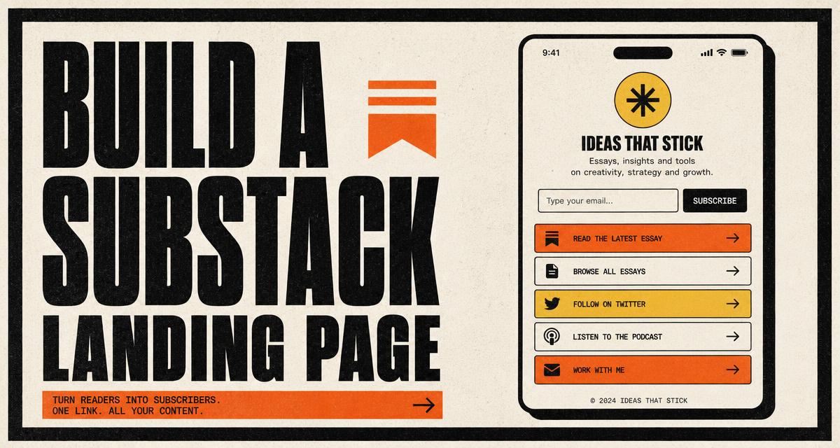
Most writers end up with the same awkward gap. Social profiles allow one link. That link has to introduce the newsletter, prove there is real writing behind it, collect the signup and point to everything else. A Substack homepage does one of those jobs well and the rest by accident.
Quillo Pages is a small page builder for exactly that gap. You get a hosted page at your own handle, with your subscribe form, your Substack archive and your links on it, styled block by block. Here is how to build one that reads well and converts, plus the mistakes worth avoiding.
What a Quillo page is
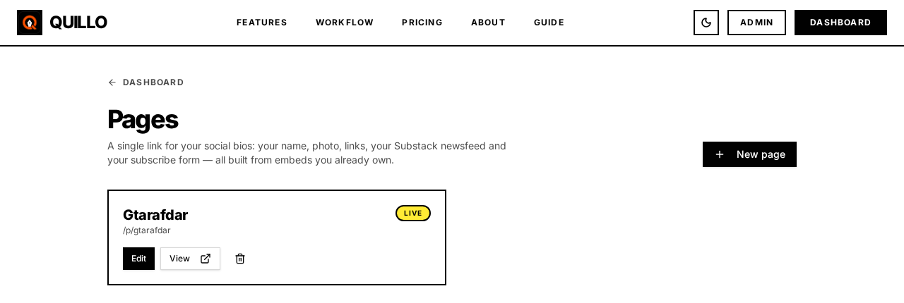
A page is a stack of blocks published at a handle you pick, for example thequillo.com/p/your-handle. The blocks are the pieces you would build by hand on a landing page: a heading, some text, a subscribe form, a newsfeed, link buttons, social icons, an image and a divider.
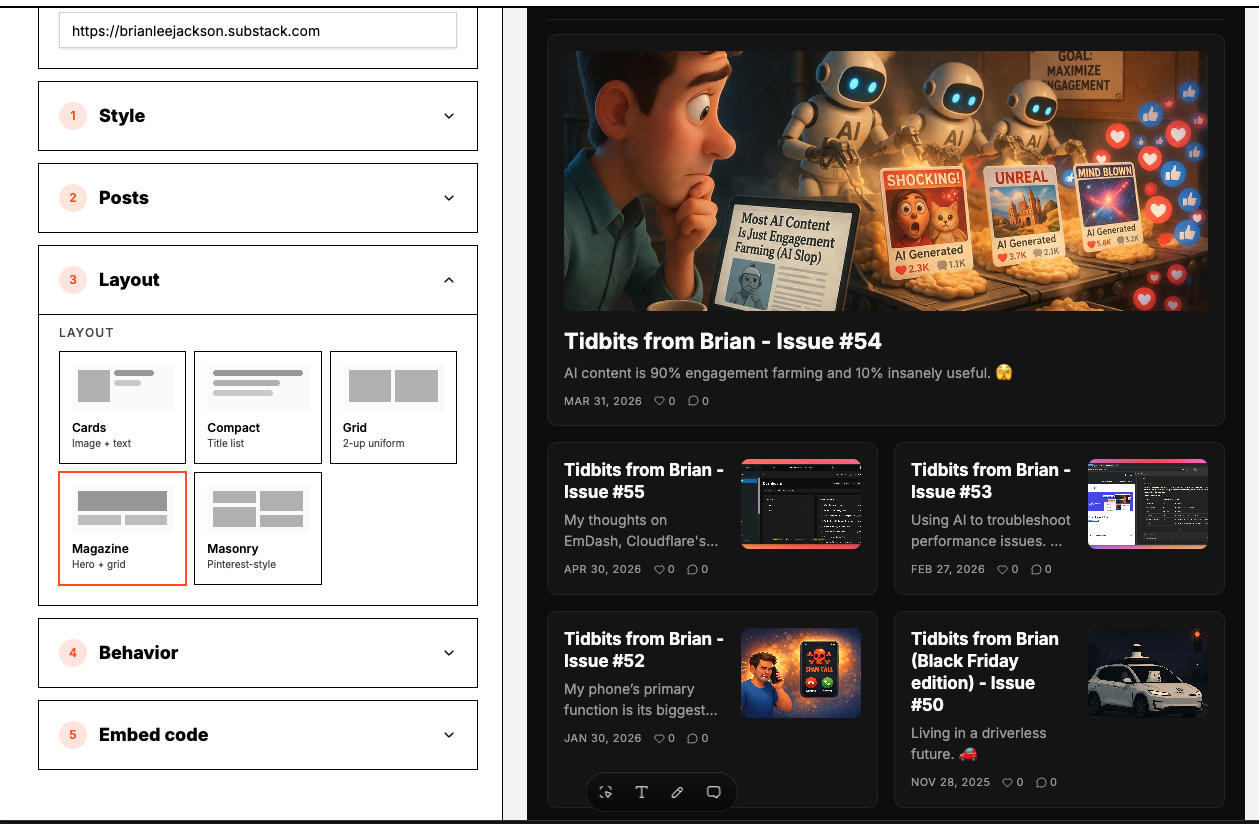
Two of those blocks are the interesting ones. The form block renders a subscribe form you already built in Embeds, and the newsfeed block renders a newsfeed you already built. You are not recreating them, you are placing them.
Seven templates to start from
A template fills the page with blocks and a coherent style so you are editing something rather than staring at an empty canvas. Applying one keeps your connected form and newsfeed in place, so you can try three templates in a row without rebuilding anything.
- Blank. An empty page with the base style, for people who would rather build up than trim down.
- Signup First. Heading, one clear promise, subscribe form above everything else. The most direct option for a paid ad or a bio link.
- Editorial. Serif headline, generous spacing, archive below the form. Reads like a publication.
- Profile Card. A centred card with your photo, a short bio, social icons and links. The closest thing to a classic link in bio.
- Midnight. A dark page with high contrast type. Good when your brand is dark and everything else looks washed out.
- Newsfeed Showcase. The archive is the hero, with the form underneath. Best when you already publish regularly and the writing is the argument.
- Growth Hero. A split hero with a bold headline, a strong call to action, social proof and the archive lower down. The most conversion focused layout of the seven.
Building the page block by block
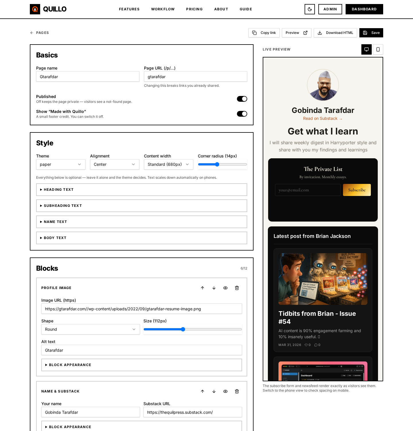
Blocks are added, reordered and removed from the builder, and the preview updates as you go. A page that works usually follows the same shape:
- Who you are and what the newsletter is about, in one heading and one sentence.
- The subscribe form, high enough that nobody has to scroll to find it.
- Proof, which is the newsfeed showing recent posts.
- Links to the things people ask for next: your site, your work, your other profiles.
- Social icons at the end.
That order matters more than the styling. A reader decides whether to subscribe in the first screen, and confirms the decision with the archive underneath.
Per block styling and alignment
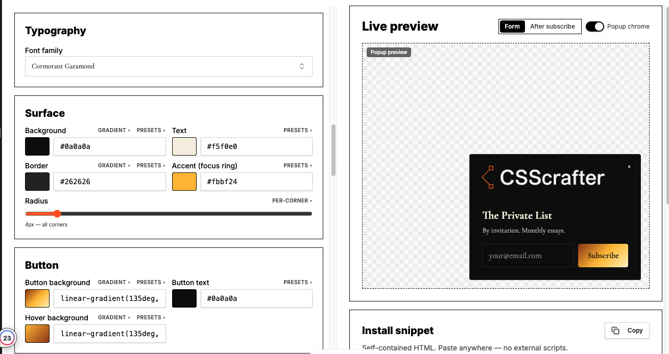
Every container on the page can be styled on its own. Background colour, border, radius, padding and content alignment are set per block, so a soft card can sit above a full width dark band without a fight.
- Heading and subheading styling: size, weight, colour and text decoration, set separately for each.
- Alignment per block, which can also override the alignment of the form or newsfeed inside it.
- Border and radius overrides for the form block, so the form can drop its own card border when it is already inside a styled container.
- Social icons that follow your page theme by default, with the option to keep official brand colours instead.
How the page behaves on phones
Most link in bio traffic is mobile, so responsiveness is not an extra. Blocks stack in order, the subscribe form switches to a stacked field and button when the space gets tight, and grid newsfeeds reflow to one column. Padding scales down so a page designed on a laptop does not arrive on a phone with half the screen as margin.
Check the page at phone width before publishing. It takes ten seconds and catches the two usual problems: a heading that wraps badly and a call to action that ends up below the fold.
Picking a handle and publishing
- Open Pages and create a page, choosing a template or starting blank.
- Pick a handle. The checker tells you immediately whether it is free.
- Connect the subscribe form and the newsfeed you want on the page.
- Publish, then paste the URL into your social profiles.
Keep the handle short and recognisable. It is the string people read in a bio, and a long one gets truncated.
Search visibility, and when to turn it off
Each page has a search visibility switch. When it is on, the page is indexable and carries a canonical URL pointing at itself. When it is off, the page is marked noindex and stays available to anyone with the link.
Turn it off for pages that exist for one campaign or one audience, and for pages with very little text. A page with a heading and three links has nothing for a search engine to rank, and publishing several of them indexed does you no favours.
What not to do
- Do not put twelve links on the page. Every extra option lowers the chance the reader takes the one you actually want.
- Do not hide the subscribe form under the archive. Proof supports the ask, it does not replace it.
- Do not write a heading about yourself when the reader wants to know what they get.
- Do not use six colours because the controls exist. Two plus a neutral is enough.
- Do not leave a page indexed when it has almost no content on it.
- Do not build one page and forget it. The archive updates itself, but the promise at the top needs a read every few months.
Why one page beats three separate links
- One URL for every profile, and it can change what it shows without you editing your bios.
- The signup and the proof are in the same place, so the reader never leaves to decide.
- Signups from the page land in your Substack list and, if storage is on, in your entries with delivery status.
- The page inherits the styling work you already did on your form and archive, so it looks like you rather than like a template directory.
Questions people ask
Where does a Quillo page live?
At a handle you choose, in the form thequillo.com/p/your-handle. The handle checker tells you whether the one you want is available before you publish.
Can I change templates after I have built the page?
Yes. Applying a template restyles the page and keeps the connected subscribe form and newsfeed, so you can compare a few directions without rebuilding blocks.
Do signups on the page work like signups on my site?
Yes. The form block renders the same subscribe form, so delivery to Substack, entry storage, retry and export behave identically.
Can I keep official social brand colours on the icons?
Yes. Social icons follow your page theme by default, and there is an option to use each network's own colour instead.
Should the page be indexed by search engines?
Index pages with real content on them. For short campaign pages or pages with only a few links, turn search visibility off so a thin page is not competing for your own name.
How many pages can I create?
There is no per page limit in the plan. Practically, a main link in bio page plus one or two campaign pages is what most writers keep in use.
Set this up in Quillo
Everything described here is part of the studio. The guide has the click by click version if you would rather follow along inside the app.
Keep reading
6 guides published. More as the studio grows.